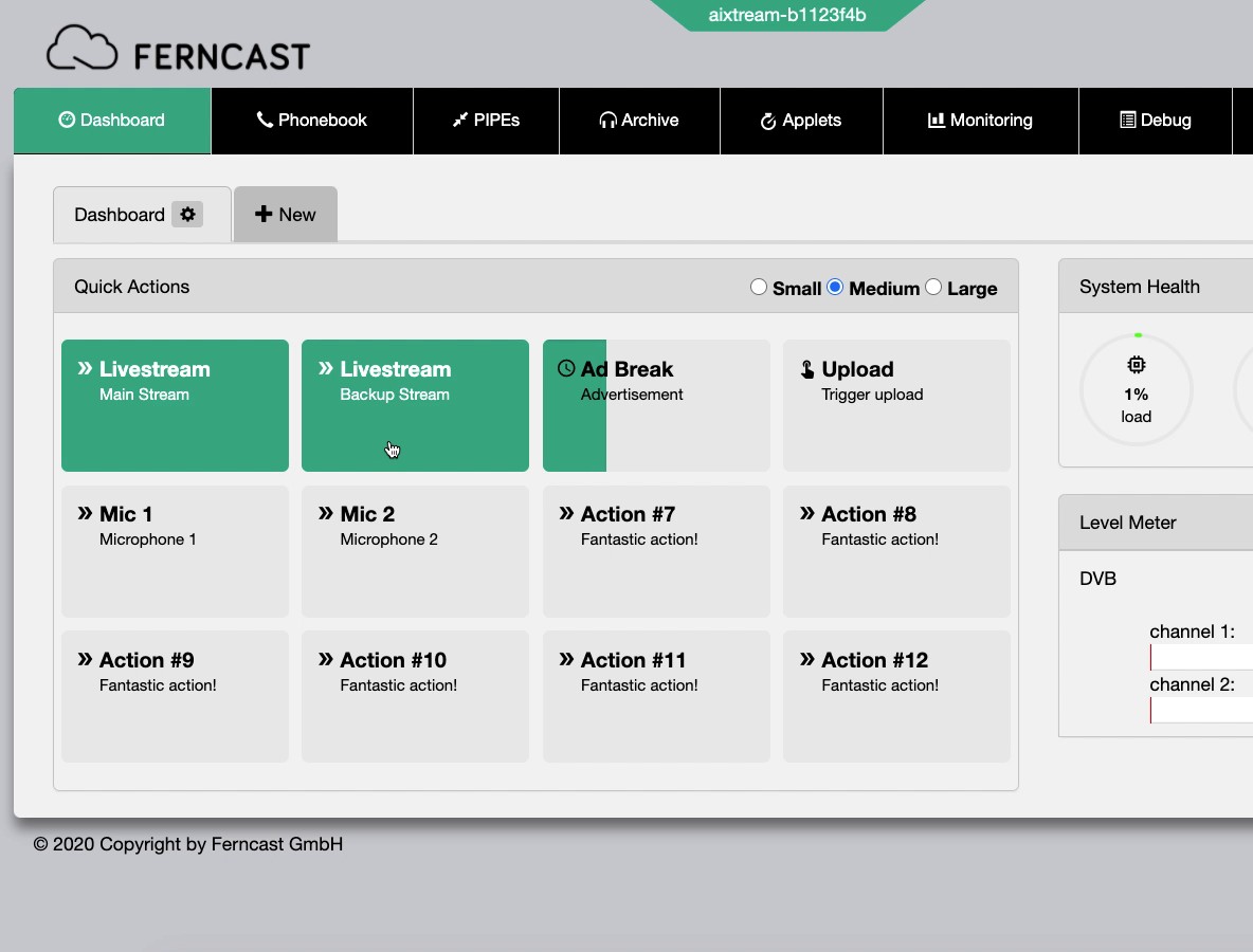
This widget allows you to create a custom button panel for controlling almost any interaction you require.
| ! | Examples of Quick Action uses |
|
| ! | Small version |
| This widget also has a small version. It is functionally identical but scaled down in size. |
Download a video demonstration here: /aixtream-manual-images/clips/quickactions-example.webm
¶ Quick Actions configuration
Before configuration, the Quick Actions widget looks like the below screenshot.
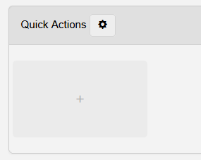
- Start configuring your first Quick Action by clicking on the large field with the + in its center.
- Once one or more Quick Actions have been configured, you can edit or move their placement by holding down the mouse button while hovering over one of them.
- The Quick Actions buttons start shaking. You are now in edit mode and can use the following functions.
- Pencil icon: Opens the Editing quickAction menu to edit this and other Quick Actions (see below for more information).
- X icon: Deletes the specific Quick Action.
- Drag and drop: Move the specific Quick Action button to a new position in the panel.
- The Quick Actions buttons start shaking. You are now in edit mode and can use the following functions.
- Once you are done making changes, click once on one of the buttons.
- The Quick Actions buttons stop shaking. You left edit mode.
¶ Cog icon: Grid Size & Protection
Click the Cog icon next to the Widget header to open the menu for Grid Size and Protection.
- Grid Size: Selects the size of the Quick Action buttons
- S: Small
- M: Medium
- L: Large
- Protection: Toggles whether editing the Quick Action buttons is possible ("Off") or not ("On").
¶ Editing quickAction
See below for the options available in the Editing quickAction menu.
| Element | Description |
| ⇐ Left side | On this side is the option to create a + New Quick Actions and the List of configured Quick Actions. |
| + New | Select this entry to create a new Quick Action. |
| List of configured Quick Actions | Lists all created Quick Actions. Select one to see and change the selected Quick Action. |
| ⇒ Quick Action settings | On this side, you see all settings available for the quick action configuration. The displayed settings are for the currently selected quick action. |
Identifier |
Shows the UUID of the selected Quick Action. This is useful to know when referencing this Quick Action in other menus. |
| Name | Sets the name of the Quick Action. This name is displayed on the Quick Action button in the button panel. |
| Subtitle | Sets the subtitle of the Quick Action. This subtitle is displayed on the Quick Action button in the button panel. |
| Active | Toggles the Quick Action active ("On") or inactive ("Off"). |
| Type |
Dropdown: Selects the type of button used.
|
| Monitor state of |
Dropdown: Selects what determines when the button displas activity (teal-green highlight).
|